We often confuse NFL helmets, and uniforms for that matter, with the franchises with which they are associated. A bad team makes its cool gear look not so cool. Who wants to wear a Jaguars jersey outside of TIAA Bank Field if the team on the field is lousy? Oh wait, that’s exactly what’s happening this year because Jacksonville has one of the sweetest helmets in the league yet owns the worst record. Maybe Trevor Lawrence will make them cool again next year.
So, while we ready our picks for Week 17, let’s try to steer clear of poisoning our opinions of this headgear just because we don’t like the team or they have been unkind to us at the betting windows. This is all about style, pizzaz, and panache so let’s get to it and go from the worst to the best based solely on looks. We’re guys, it’s how we judge, don’t take offense ladies.
32. Cleveland Browns – It’s unimaginative…much like their offense. Who thought an orange helmet without anything else on it, except a brown and white stripe down the middle, would appeal to the average fan?
31. Green Bay Packers – Green Bay stole the design from the Browns but upped the game by changing the color to yellow and sticking a big old G on the helmet. Genius.
30. Chicago Bears – The Bears took a gander at what the Packers were doing and were wowed by the whole singular letter thing. They stole that idea but changed the color to black and stuck a C on the side. Marketing genius.
29. Indianapolis Colts – A white background with a blue horseshoe. Be still my heart.
28. Washington Football Team – Before they lost their name, the Washington helmets were crimson with a cool graphic of an Indian chief. Now they’ve got the player numbers on them. Hopefully, a new name will change things for the better in DC but for now, they’re just blah.
27. Arizona Cardinals – White helmets don’t do it and when you have a lame graphic of a small bird trying to look tough, it’s embarrassing. Stop it Arizona.
26. Buffalo Bills – Now that Buffalo has arrived as the new AFC East kings, they really need to jazz up their headgear. The Buffalo logo is okay but it’s tired and in need of a makeover.
25. New York Giants – Blue background, white letters (NY). The only reason this isn’t ranked lower is that the bottom of the Y slides is left under the N. We’re very easy to amuse.
24. Minnesota Vikings – First off, purple is a terrible color for any team. Secondly, the “horns” on the Vikings’ helmets look like they were drawn by a third-grader. Do better Minnesota.
23. Seattle Seahawks – We are officially at the point where the helmets are no longer horrendous and arguments can be made that the Seahawks headgear should be higher on this list. However, the graphic looks like Toucan Sam on the Froot Loops box and that’s a bad look for a good team.
22. Cincinnati Bengals – The Cats have orange helmets with stripes that look like someone spilled black paint over the top that trickled down the sides. Still, it’s weird enough to capture our interest…just a bit.
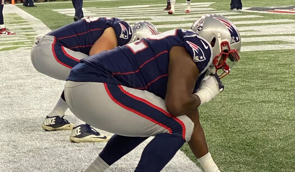
21. New England Patriots – Bob Kraft ditched Pat Patriot for Flying Elvis and it never sat well with the stodgy, old New Englanders. It was one of the few poor choices Kraft has made since he took over. There’s another that leaps to mind but that’s a topic for another day.
20. Denver Broncos – The navy-blue background is better than the orange of old but the horsey looks a bit winded.
19. Detroit Lions – Silver background with a royal blue lion. What lion is royal blue and don’t you want to see fangs and claws? Hell yeah!
18. Philadelphia Eagles – Green background with white wings on the forehead. Are these the eagles or the angels?!
17. LA Chargers – White background with a little yellow bolt outlined in royal blue. The bolt needs to be more menacing as do the colors. This is the NFL, not community theater.
16. Tennessee Titans – The dark blue helmet accompanied by a T logo with some sort of contrail exiting its backside. Seems highly flammable and what’s it all mean?
15. Miami Dolphins – If this helmet was a song it would be a show tune. You can almost see a guy in white shoes belting out Oklahoma as he taps his way all over the stage.
14. Kansas City Chiefs – The color is a vibrant red and the letters KC interlock inside an arrowhead. Solid helmet but not one fit for Super Bowl champs. Don’t delay to acquire SuperBowl tickets so you may meet your favorite NFL stars or cheer with other fans of your favorite team during the big game.
13. New York Jets – Don’t judge until you’ve seen the new version. Sure, the old one would be one of the first few you read about but the new helmets have this electric green with a much sleeker font for the letters J-E-T-S lurking over a football. Most improved.
12. Houston Texans – The Texans have a handsome helmet replete with the shape of a steer and the lone star branded right on its forehead. You can almost hear a country song playing in the background.
11. Baltimore Ravens – This is a more sinister version of the Seahawks helmet. The black background, with the glowering bird, suits this team perfectly.
10. Atlanta Falcons – The mat black background with the white and red outline of a wing-spread falcon works well. They don’t call them the Dirty Birds for anything.
9. Carolina Panthers – Silver background with a panther bearing its fangs is a good look for a frightening football team. Maybe Carolina should lend theirs to a more deserving franchise and create one more fitting using lollipops and puppy dogs.
8. Los Angeles Rams – The old, dark blue and gold, was preferable to the new royal blue and yellow but the swirled horn on both sides remains the same and that’s flat out cool.
7. Las Vegas Raiders – The Silver & Black never gets old and the patch-eyed pirate with crossed swords on the side of the helmet channels the ferocious teams of the 70’s that carved the legacy the team rests their reputation on to this day.
6. San Francisco 49ers – There’s just not enough panache on these helmets today but the 49ers have never wavered with the white letters, SF, encircled in crimson on a gold canvas.
5. Pittsburgh Steelers – Black background and nothing but business, just like the no-nonsense city from which they hail. The three hypocycloids to the right of the word “Steel” signify: steel lightens your work, brightens your leisure, and widens your world. The more you know.
4. New Orleans Saints – The fleur-de-lis is the big, bold, beautiful symbol that adorns the side of the Saints’ golden domes. It’s iconic and worthy of the Drew Brees Saints we know today, and certainly not of their previous incarnation as the Ain’t.
3. Dallas Cowboys – There’s nothing that says America’s Team like the big ol’ blue star on the side of the Dallas helmet. It’s simple but it never gets old, and it works!
2. Tampa Bay Buccaneers – While it’s true Tom Brady has brought a newfound swag to the Bay, the Bucs’ platinum helmets, styled with a skull and cross swords on the banner of a blood-red flag, elevate this pirate platform to new heights.
1. Jacksonville Jaguars – There are a few versions of this helmet but they all work from the multi-layered colors to the artistic design of an open-mouthed, fang-dripping big cat. The Jags might be the worst team in the league but these helmets are Super Bowl-worthy.
Check also:

